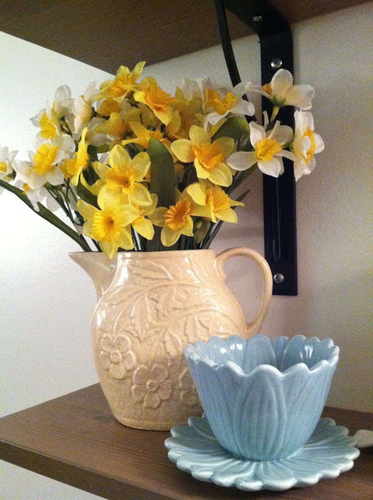
Ok, so they're fake daffodils, but at least they won't wilt.

These are the birds I've been getting at Michael's. The white ones are from last year, and the green one is new. I think they're adorable! And the squirrels stay out year round.
And last night I got to play around with some tags and things, finally using the Spring colors that Tim Holtz released last year, back when they were going to be seasonal only and not part of the regular Distress line.

This is Shaded Lilac, in a tone-on-tone attempt at this background technique: here. But the stamping wasn't great so the colors got funky.

Attempt #2 at the above. But it bugs me that the design is off center, so I didn't do anything with this.
Off to not such a great start, but at least the colors made me happy. And then I took the Squeezed Lemonade Distress color, along with Bundled Sage and a little bit of Forest Moss, added some Tattered Angels Glimmer Mist and a super sneaky high-tech material*, and started this ATC:

It was at this point, mostly finished, that I realized I should've been taking pictures of the process.

Finished, with Rock Candy Distress Crackle Paint glaze and 7 Gypsies studs.
That ATC has inspired a series, which I hope to work on soonish. But there's a set of stamps I want to get in order to do it, so it might be a while. In the meantime, I'm pleased with how this turned out. It's simple but pretty cool. And it's bright, which makes me feel like Spring is not so far away. It's not, is it?
*My secret weapon: tissue paper. Shhh!
2 comments:
I like the lavender ATC. What's wrong with it? Love the yellow one. Yellow is an essential color for mood enhancement this time of year!!
Gorgeous work - I LOVE the yellow ones - the unicorn is fabulous and I really like the crackle effect. The blue and white tags are gorgeous - why not re-trim the tag that's off-centre - it means it will be a little narrower and shorter but still usable? It's too good to discard! Finally - I am coveting your cream patterned jug! It's just beautiful and looks so good with daffodils in it - that is such a lovely spring display - I am beginning to feel the time is right to change my place back to spring colours again.
Post a Comment