I haven't been using my usual colors or motifs.
My aesthetic has been drifting.
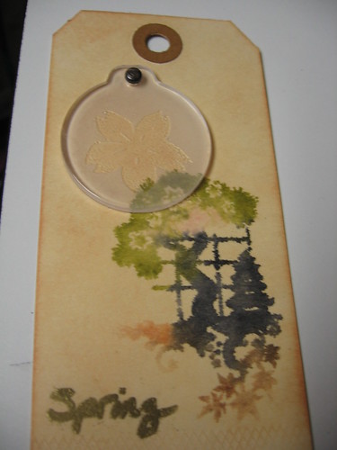
The colors I've been using have been bright, and feminine, and, well... Springy. I've been using flowers and green things. I know I'm not really as rock and roll as I like to pretend, but this stuff is just so not me. And yet, I love it. After this past Winter, I'm finding it hard to deal with dark colors. I want bright and more bright. Sunlight and growing things and warmth. It's Spring Fever. So I've cranked out these:
(I tried a couple of Tim Holtz techniques that I hadn't tried before on this one.)
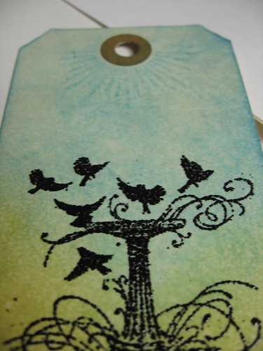
(The rays at the top are one of Michelle's stamps from her Stairway to Heaven set, and it was just what this tag needed.)
(This is where I realized I'd gone outside my normal pallete and style...)
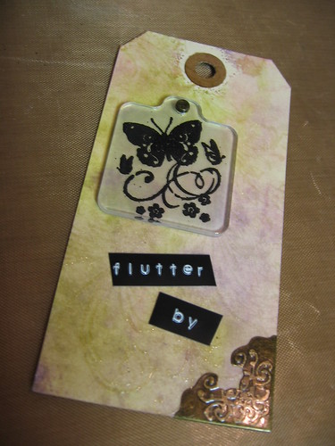
And something a little different. I got a cheap frame at Target, and put something together just for that:

The flowers are Prima flowers with a Tim Holtz Foliage flower. The background is a paper from a Rock n Roll themed pack I have, embossed with a flourish and then whitewashed and wiped so the embossing acted as a resist (it's a Tim technique). I added a ticket in an Ornate Frame and metal corners to give it a bit more something.
I've got lots to show, but for now I'll just stick with the Spring stuff. Soon, though, I hope to have enough to show of a series I'm working on. Let's just say that HIM was awesome in Baltimore, and after the concert I was really really inspired.
P.S. Links to Michelle and Tim's blogs are in the sidebar.